
Transform Your Kitchen: The Ultimate Guide to Cabinet Colors
Choosing the right paint for your kitchen cabinets can feel overwhelming when you're staring at old oak doors, dated white boxes, or a color chip wall that all starts to blur together. Cabinet color drives the whole room. It changes how bright the kitchen feels at breakfast, how clean it looks at night under LEDs, and whether the space reads current or stuck in another decade.
For most Central Florida homes, the best choice isn't just about what's trending. It has to work with strong daylight, warm evenings, mixed bulb temperatures, family traffic, and the kind of finish that still looks good after hands, grease, cleaning, and daily use. That's where a lot of generic color lists fall short. They talk about inspiration, but not enough about what sprays well, what shows touch marks, what goes muddy under the wrong light, or what pairs cleanly with the counters and hardware you already own.
This guide focuses on paint for kitchen cabinets colors that hold up in real homes. You'll find 10 strong directions for 2026, along with practical pairing advice, finish recommendations, and trade-offs from a refinishing perspective. Some colors are forgiving. Some are beautiful but demanding. Knowing the difference before you paint saves money, frustration, and second-guessing.
Table of Contents
- 1. Crisp White & Off-White
- 2. Soft Gray & Greige
- 3. Navy Blue & Deep Blue
- 4. Sage Green & Muted Green
- 5. Charcoal, Graphite & Soft Black (subtle sheen options)
- 6. Two-Tone Cabinetry (Contrasting Upper & Lower)
- 7. Warm Taupe & Warm Greige
- 8. Creamy Ivory & Buttercream
- 9. Blush Pink & Warm Mauve
- 10. Natural Wood Stain & Light Wood Tones
- Top 10 Kitchen Cabinet Color Comparison
- Ready for a Flawless Finish? Let's Find Your Perfect Color
1. Crisp White & Off-White
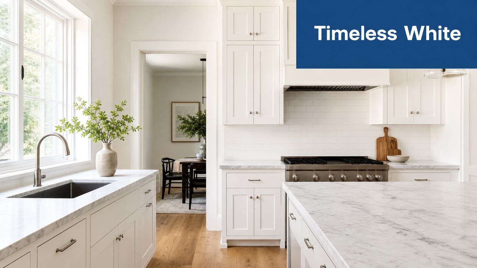
Late morning sun hits a Central Florida kitchen hard. A white cabinet color that looked clean on a paint chip can read blue, stark, or almost glossy once that light bounces off tile, quartz, and stainless. Crisp white still works, but only when the undertone, sheen, and topcoat are chosen for the room it lives in.
White remains one of the safest cabinet colors for resale and one of the easiest to pair with changing finishes. It brightens compact layouts, settles down busy counters, and gives you more freedom if you want to swap out hardware or backsplash later. The catch is simple. Pure bright white is less forgiving than homeowners expect, especially in kitchens with strong daylight and warm artificial lighting at night.
Why white still works
In my experience refinishing cabinets in Florida homes, off-white usually holds up better visually across the full day. A soft white with a touch of warmth stays cleaner-looking under natural light, LED strips, and warm pendant bulbs. That matters more than trend talk, because cabinet color has to look right at breakfast, at noon, and after sunset.
Pair white and off-white with materials that give them some structure. Warm brass or aged bronze hardware adds depth. Matte black works if the kitchen already has other black accents, such as window frames or light fixtures. For countertops, white quartz with subtle movement, marble-look slabs, and even some quieter granites all work well. Wood shelves, oak flooring, or a natural-toned island also keep the room from feeling flat or overbuilt.
If you are still sorting through shades, this guide on what colour to paint kitchen cupboards can help narrow the direction before you sample in the room.
A simple rule saves a lot of mistakes. Match the cabinet white to the fixed surfaces, not the sample card. Warm floor, warm white. Cool counter, softened white that does not go icy.
Finish quality decides whether white cabinets look custom or tired after a year. Satin and soft semi-gloss are usually the best choices because they clean well without throwing harsh glare across every door and drawer front. On white cabinets especially, brush marks, heavy stipple, and weak adhesion show fast. A sprayed cabinet-grade system with a durable topcoat gives a smoother finish and stands up better to humidity, hand oils, and routine wipe-downs than standard wall paint ever will.
2. Soft Gray & Greige
Soft gray had a long run, and in the right kitchen it still looks sharp. The difference now is that the best versions aren't icy. They lean toward greige, mushroom, or a warmer gray-beige blend that doesn't fight with Florida sunlight or warm flooring.
This color family works well in transitional homes, rentals that need broad appeal, and kitchens with white quartz or subtle veining. It can also calm down busy granite that would feel too stark against pure white cabinets.
Where gray goes wrong
Gray fails when homeowners pick it from a chip under store lighting and never test it in the kitchen. In morning light it may look elegant. By evening, especially under warm bulbs, it can turn muddy or violet. In rooms with limited daylight, a cool gray can feel heavy even if the color itself is light.
The smartest approach is to sample several close shades on removable boards and move them around the room. Check them next to backsplash tile, floor color, and the metal finish you plan to use. Brushed nickel, matte black, and unlacquered brass can all work, but each one changes how the gray reads.
- Best countertop match: White quartz, soft marble veining, and pale concrete-look surfaces usually keep gray cabinets crisp.
- Best floor balance: Medium oak and other warm woods stop soft gray from leaning cold.
- Best sheen choice: Satin often looks more refined than high gloss on gray, because it hides minor surface texture better.
Gray isn't outdated. Bad gray is.
If you're looking at paint for kitchen cabinets colors and want something safe but not plain, warm greige is often the better long-term bet than a blue-based gray.
3. Navy Blue & Deep Blue
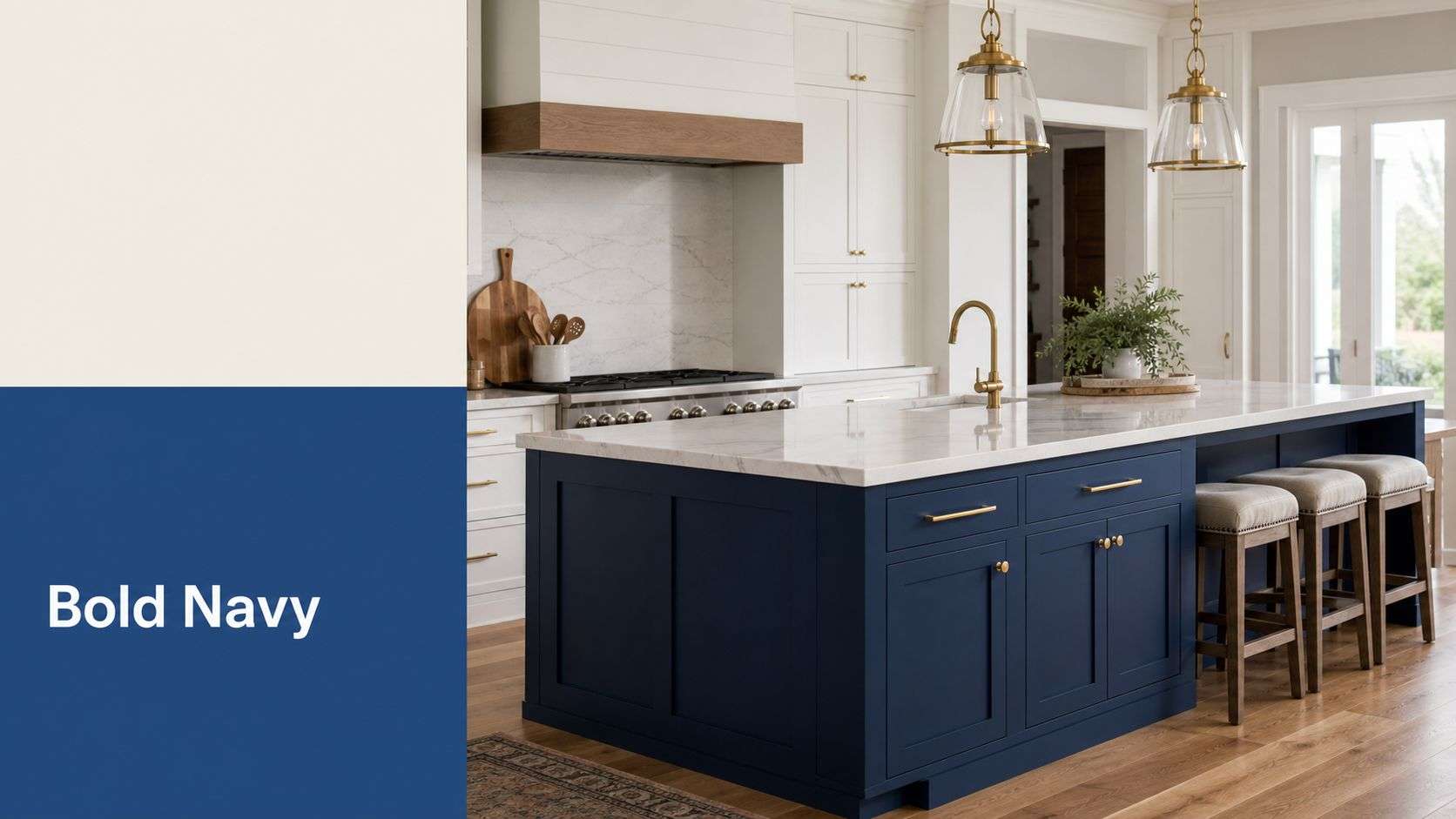
Navy makes a kitchen look intentional. It adds weight, contrast, and a custom feel that white alone can't always deliver. Used well, it looks polished. Used badly, it can make the whole room feel darker than it is.
This color works especially well on lower cabinets or a large island. That's where you get the visual impact without wrapping the entire room in a deep tone. In open-plan Central Florida homes, a navy island can also anchor the kitchen without competing with nearby living spaces.
Best pairings for dark blue cabinets
Navy needs relief around it. Light countertops, a bright backsplash, and strong task lighting keep it from feeling closed in. White quartz, marble-look slab, and warm brass hardware are the most dependable pairings because they add light and definition.
Dark blue also shows flaws differently than white. Brush marks, uneven sheen, and filler repairs stand out more on deep colors. That's why application quality matters so much here. A sprayed finish with proper prep gives navy the smooth, rich surface that homeowners want when they choose this color.
- Use it on islands first: If you're nervous, test navy on one feature area instead of the full perimeter.
- Choose warm metals: Brass and champagne bronze give navy life. Chrome can make it feel colder.
- Keep the walls restrained: Creamy white or soft greige walls usually support navy better than another bold color.
Blue remains strong in kitchen design, but it works best when the room has enough light and the finish is flawless. Otherwise every fingerprint, touch-up, and glare line starts to show.
4. Sage Green & Muted Green
A lot of Central Florida homeowners ask for color without the commitment of blue or the maintenance headaches of black. Sage and other muted greens usually land in the sweet spot. They soften a kitchen, work with the daylight we get here, and still feel settled a few years later.
Green is showing up more often in kitchen design, as noted earlier, but the versions that hold up best on cabinets are the quieter ones. Sage, olive, dusty eucalyptus, and other softened greens with gray or beige undertones read calmer and more expensive than bright, yellow-heavy greens. On cabinet doors, that undertone matters. It decides whether the finish feels grounded or starts looking trendy.
Where muted green works best
Muted green does its best work when the rest of the kitchen supports it. White quartz, creamy subway tile, warm marble-look counters, and natural wood accents all pair well because they keep the room bright and give the color some contrast. For hardware, I get the most consistent results with brushed brass, champagne bronze, or aged nickel. Polished chrome can make sage feel cooler and a little flatter than homeowners expect.
This color also gives you more flexibility than many people realize. Sage lowers with warm white uppers work well in kitchens that need to stay open and light. A full run of muted green cabinets can look excellent too, but only if the room has enough natural light and the finish is clean and even.
Lighting changes everything here.
Green shifts more than gray or beige between morning sun, cloudy afternoons, and evening bulbs. In Central Florida homes with strong window light, sage often reads almost neutral during the day. Under warm under-cabinet lighting or older interior bulbs, that same color can turn muddier or darker. Test large samples at the sink wall, range wall, and island before committing. I do not trust a tiny fan-deck chip for green.
From a refinishing standpoint, muted green is forgiving in one way and demanding in another. It hides dust and everyday smudges better than white, but blotchy prep, heavy brush texture, and uneven topcoat sheen still show up fast, especially on flatter door styles. A sprayed finish with a durable cabinet-grade topcoat gives green the soft, smooth look people want from this color.
If the goal is a cabinet color with some personality that still works with warm counters, mixed metals, and Florida light, muted green is one of the safer choices on this list. The right shade looks custom, not loud.
5. Charcoal, Graphite & Soft Black (subtle sheen options)
Charcoal and soft black cabinets can look expensive fast. They create contrast, sharpen architectural lines, and make simple shaker doors feel more refined. But these colors are less forgiving than almost any other option on this list.
The biggest issue isn't style. It's maintenance and finish quality. Dust, hand oils, dried water spots, and edge wear all show more quickly on dark cabinets, especially around trash pull-outs, sink bases, and drawers near the cooktop.
Finish choice matters more than color here
A dead-flat black sounds good on paper, but in real kitchens it can scuff and chalk visually. A subtle satin or soft sheen usually performs better. It reflects enough light to keep the room alive and makes wiping the surface easier.
Charcoal is often the safer choice than true black in Central Florida homes. It still gives drama, but it doesn't create the same hard contrast against white ceilings and bright daylight. Graphite also tends to work better with mixed countertop materials, especially if the counters have beige, taupe, or warm veining.
- Best hardware: Warm brass for contrast, matte black for a monochrome look, or stainless if the kitchen already has a strong modern feel.
- Best countertops: White, pale gray, or lightly veined stone. Dark counters on dark cabinets can flatten the room.
- Best placement: Lower cabinets or island only, unless the room has strong natural light and plenty of visual breathing room.
If the homeowner wants dark cabinets but worries about upkeep, I usually steer them toward charcoal before black. It gives most of the same impact with fewer regrets.
6. Two-Tone Cabinetry (Contrasting Upper & Lower)
A two-tone kitchen solves a problem I see all the time in Central Florida homes. Homeowners want more character than plain white, but they do not want the room to feel heavy or dated once the afternoon sun hits it. Keeping the lighter color on top and the deeper color below usually fixes both issues.
This layout works because it respects how a kitchen is seen and used. Upper cabinets sit in the light and around eye level, so lighter paint keeps them from closing the room in. Lower cabinets take the traffic, the kicks, the mop splatter, and the chair bumps, so a mid-tone or darker color often wears better visually over time.
Pairings that look intentional, not trendy
The best combinations have a clear difference in depth. Warm white uppers with sage lowers, creamy ivory over navy, and soft greige uppers with charcoal bases are all strong options for Florida kitchens because they balance brightness with some grounding. If both colors are too similar, the kitchen can look like a color mismatch instead of a design choice.
Countertops and hardware matter more in a two-tone kitchen than they do in a single-color layout. Quartz with soft movement usually ties the top and bottom colors together better than a busy granite pattern. For hardware, I usually recommend one finish across the full kitchen. Brushed brass warms up white, ivory, sage, and navy nicely. Satin nickel is safer when the counters lean cool or the appliances already set that tone.
If you want to see how those combinations read in real spaces, these two-tone cabinet color changes show the contrast more clearly than a paint chip ever will.
The lower run carries the visual weight. Put the darker color there, and the room usually feels settled.
Durability is part of the appeal here too. Darker lowers hide scuffs and everyday wear better than light paint at floor level, while lighter uppers help bounced daylight move around the room. In refinishing work, I also pay close attention to sheen. A soft satin is usually the sweet spot. It gives enough washability for busy kitchens without throwing glare across the upper doors.
Two-tone cabinetry also gives more flexibility if the kitchen opens into living spaces with mixed flooring, warmer wall colors, or varied stone surfaces. It adds personality without locking the whole room into one strong cabinet color. For homeowners who want contrast but are not ready for a full kitchen of navy, green, or charcoal, this is often the most practical middle ground.
7. Warm Taupe & Warm Greige
Warm taupe is quiet, but it's not boring. It gives you more depth than white and more softness than gray. In kitchens that need to feel current without looking cold, this color family does a lot of heavy lifting.
It works especially well in homes with travertine tones, warmer flooring, tan or cream veining in the counters, and living spaces that already lean natural rather than stark modern. Warm greige can also bridge old and new materials better than most cabinet colors.
How to keep warm neutrals from looking flat
The mistake here is choosing a taupe that's too muddy or too close to the wall color. Cabinets need enough distinction from the surrounding surfaces to read as a finish choice, not background color. A good warm taupe has some beige, some gray, and enough clarity to hold shape in daylight.
Hardware and texture matter more than people think. Brass, bronze, dark iron, or even simple wood accents can bring these cabinets to life. So can a backsplash with hand-made variation, a subtle stone movement, or open shelving in walnut or white oak.
- Best room style: Transitional, modern traditional, and softer contemporary kitchens.
- Best topcoat look: Satin gives warm taupe a furniture finish without making it shiny.
- Best companion colors: Cream walls, soft white trim, muted green accents, and natural wood.
Warm taupe is one of the safest paint for kitchen cabinets colors when a homeowner wants something elegant that won't feel dated the moment trends shift.
8. Creamy Ivory & Buttercream
Late afternoon sun hits a lot of Central Florida kitchens hard. A white cabinet that looked clean in the morning can turn glaring by 3 p.m., especially against warm tile, tan veining, or older trim details. Creamy ivory and buttercream solve that problem well. They keep the room bright, but the finish reads softer and more settled.
I use this color family in kitchens that need warmth without looking yellow. It fits farmhouse, traditional, and transitional homes, but the bigger advantage is how well it handles real-world materials. Cream sits comfortably next to travertine, warm quartz, oak floors, wood beams, and stone backsplashes that can make a cooler white feel sharp or out of place.
Best supporting materials
Pair creamy cabinets with unlacquered brass, antique bronze, or aged nickel if you want the color to feel intentional. For countertops, softer whites, cream-based quartz, and natural stone with beige or gold movement usually work better than stark cool gray slabs. A handmade-look backsplash, honed finishes, and white oak accents also help the cabinet color feel finished instead of generic.
Durability matters here because cream shows age in a different way than white. The wrong clear coat can amber, especially in kitchens with strong UV exposure, heat, and cooking residue. I prefer a cabinet-grade system with a stable topcoat in satin or low-sheen. That keeps the color warm without drifting darker over time and gives the doors a smoother, furniture-like finish.
Soft cream ages well. Cheap topcoats do not.
This is also one of the safer choices for busy family kitchens. It hides dust, light smudging, and everyday wear better than bright white, while still reflecting enough light to keep the room open. If the goal is a cabinet color that feels polished, works with warm Florida light, and holds up beyond short-term trends, creamy ivory and buttercream earn their spot.
9. Blush Pink & Warm Mauve
A blush cabinet color can look expensive at 9 a.m. and muddy by dinner if the lighting is wrong. That is the challenge with pink-based cabinetry in Central Florida homes. Strong sun, warm interior bulbs, and reflected color from beige tile or wood floors can shift this palette fast.
Handled well, blush and warm mauve read soft, refined, and custom. They fit best in kitchens that already have some warmth in the fixed finishes, especially homes with light oak, creamy stone, or softer wall colors. I usually see the best results on an island, a vanity-style hutch run, or lower cabinets paired with quieter uppers rather than on every cabinet in the room.
Where this color works best
Muted versions perform better than sweet or powdery pinks. Look for dusty blush, clay pink, or mauve with a brown or gray undertone. Those shades have a better chance of staying grounded once daylight, under-cabinet lighting, and nighttime bulbs all hit the finish from different angles.
Pairings matter here more than with safer neutrals. Warm brass, aged bronze, and even select matte black hardware can work, depending on the countertop. For counters, creamy quartz, soft white stone, and surfaces with gentle taupe or sand movement usually support the color best. Bright cool gray counters often make blush cabinets feel disconnected. If the kitchen still feels too dark overall, ways to lighten dark kitchen cabinets without replacing them can help you decide whether this color belongs on all cabinets or only as an accent.
Finish quality makes or breaks this look. Blush and mauve show brush marks, uneven build, and color variation more than a standard greige or white. I prefer a cabinet-grade satin or low-sheen finish because it keeps the color soft and furniture-like without flattening it out. In active kitchens, a durable topcoat also matters. Grease, hand oils, and repeated cleaning will dull a weak finish long before the color stops feeling current.
This is a personal color choice, not a safe resale default. In the right kitchen, though, it can look far more refined than another expected neutral. The difference comes down to undertone control, clean pairings, and a finish that holds up under real use.
10. Natural Wood Stain & Light Wood Tones
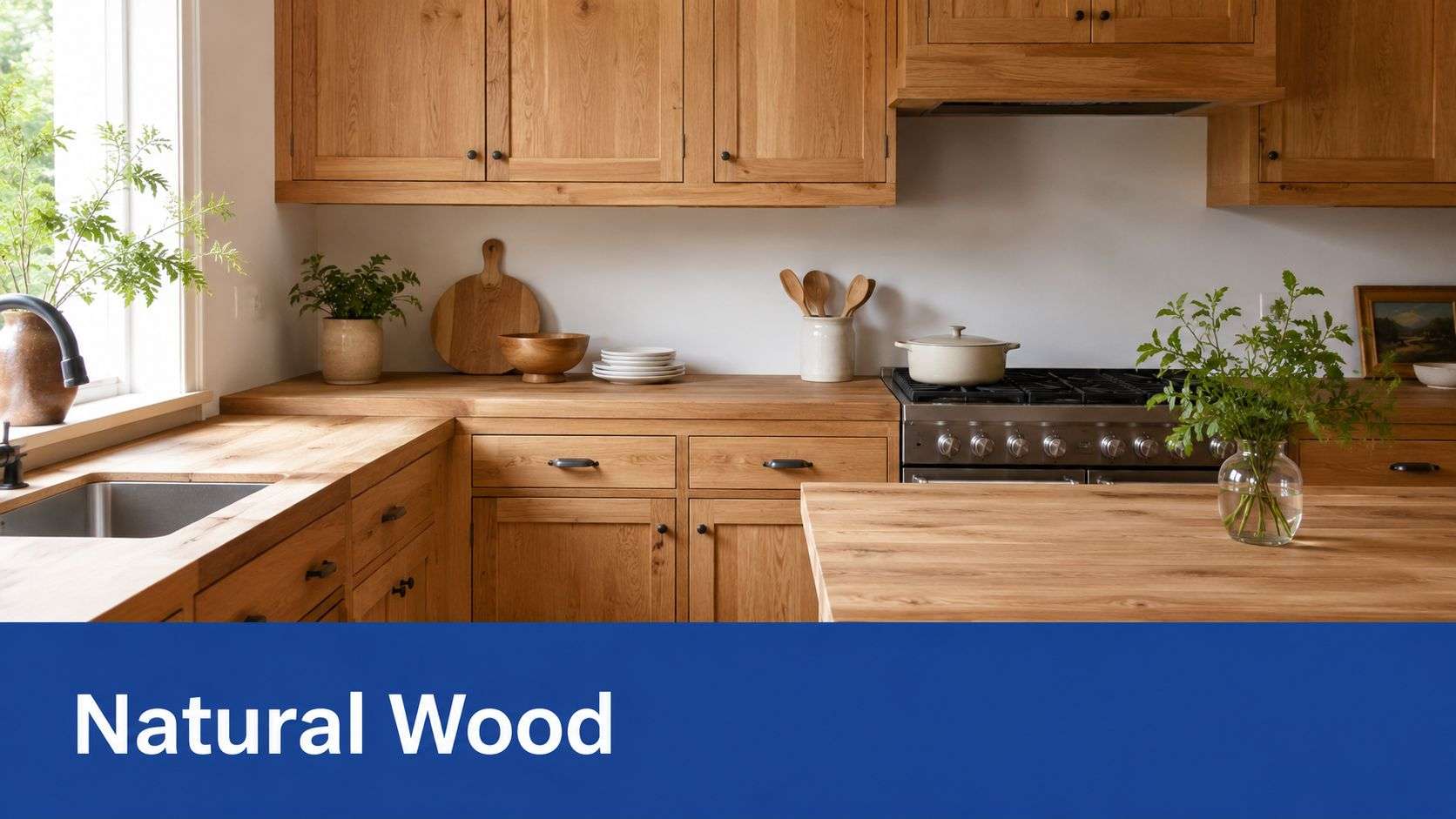
A kitchen can feel lighter and more current without covering every cabinet in paint. On the right door style and wood species, a light stain or clear natural finish gives the room warmth that painted cabinets often miss.
That approach works especially well in Central Florida homes. Strong daylight can make flat painted colors feel washed out by noon, while natural wood keeps its depth from morning sun through evening under-cabinet lighting. In open kitchens with a lot of glass, light oak, white oak looks, and other soft wood tones usually read calmer and less stark than another bright painted finish.
When stain beats paint
Stain makes sense when the cabinet boxes and doors are built from wood worth showing off. Good grain, solid door construction, and clean lines usually justify refinishing instead of hiding everything under primer and paint. In those cases, the goal is not color alone. The goal is a cleaner, lighter finish that still looks like real cabinetry, not a coated surface.
There are trade-offs. Lightening dark wood is more labor-intensive than many homeowners expect, and some species fight you the whole way. Heavy red undertones, uneven grain, water damage, and old stain buildup can leave blotching or color variation if the prep is rushed. If your cabinets start out especially dark, this guide on how to lighten dark kitchen cabinets without replacing them will give you a realistic sense of what the process involves.
Pairings matter. Light wood tones look strongest with white quartz, creamy stone, soft taupe veining, or soapstone-look counters that add contrast without turning cold. For hardware, I usually see the best results with brushed brass for warmth, matte black for a cleaner modern edge, or simple wood pulls when the goal is a quieter organic look.
Finish selection decides whether this style feels custom or unfinished. A good clear topcoat should protect against hand oils, moisture, and routine cleaning while keeping the wood natural-looking. Satin and low-sheen finishes usually hold up best in busy kitchens because they soften glare and hide minor wear better than a glossy clear coat, which can look plastic fast in bright Florida light.
Top 10 Kitchen Cabinet Color Comparison
| Style | Implementation complexity | Resource requirements | Expected outcomes | Ideal use cases | Key advantages |
|---|---|---|---|---|---|
| Crisp White & Off-White | Moderate, thorough prep to avoid visible brush marks | Primer, semi-gloss/satin or conversion varnish, experienced applicator | Bright, timeless, visually larger neutral backdrop | Small/dark kitchens, resale-focused, any design style | Universally appealing, easy to coordinate, brightens space |
| Soft Gray & Greige | Moderate, careful undertone selection and lighting tests | Multiple color samples, quality topcoat (conversion varnish recommended) | Sophisticated, balanced neutral that hides wear better than white | Contemporary/transitional kitchens seeking a modern update | On-trend yet safe, flatters many countertops, forgiving maintenance |
| Navy Blue & Deep Blue | High, dark pigments need meticulous prep and flawless application | High-quality paint, conversion varnish, strong task lighting | Dramatic, sophisticated focal point with strong curb appeal | Statement islands, two-tone schemes, modern/coastal styles | Bold but refined, hides stains, pairs well with warm metals |
| Sage Green & Muted Green | Moderate to high, undertones shift with light; sampling essential | Multiple brand samples, quality topcoat, color consultation | Calming, nature-inspired aesthetic with subtle sophistication | Farmhouse, cottagecore, contemporary transitional, lower cabinets | Distinctive neutral alternative, pairs well with wood and brass |
| Charcoal, Graphite & Soft Black | High, unforgiving for imperfections; expert finish needed | Professional-grade paint, conversion varnish, abundant lighting | Dramatic, designer-quality look with strong contrast | Large, well-lit kitchens, industrial/minimalist, islands | Upscale impact, excellent at hiding dirt, high contrast with light surfaces |
| Two-Tone Cabinetry (Contrasting Upper & Lower) | High, more complex planning and precise execution | Two paints, extra prep, skilled craftsmanship, coordinated samples | Layered, custom look that maintains brightness while adding depth | Homeowners wanting personality without full-room bold color | Flexible design, allows bold accents, strong resale appeal |
| Warm Taupe & Warm Greige | Moderate, select warm undertones carefully | Paint samples, quality topcoat, pairing with warm woods | Cozy, inviting neutral that reads timeless and balanced | Transitional and modern-traditional kitchens seeking warmth | Timeless warmth, versatile, hides wear better than white |
| Creamy Ivory & Buttercream | Moderate, avoid yellowing with proper topcoat | High-quality topcoat (non-yellowing), sample testing, semi-gloss option | Warm bright classic look, softer than stark white | Farmhouse, traditional, transitional designs desiring warmth | Bright yet warm, timeless, coordinates easily with materials |
| Blush Pink & Warm Mauve | Moderate, lighting-sensitive; requires confident selection | Multiple samples, color consultation, quality paint | Soft, design-forward personality without extreme boldness | Eclectic, cottagecore, modern farmhouse; islands or lower cabinets | Unique and inviting, pairs with warm metals, trend-forward |
| Natural Wood Stain & Light Wood Tones | Moderate, depends on existing wood condition and prep | Wood assessment, stain samples, sealers/topcoats, periodic maintenance | Warm, authentic grain-forward aesthetic that feels timeless | Farmhouse, modern-natural, transitional when wood is in good condition | Authentic warmth, timeless appeal, showcases craftsmanship |
Ready for a Flawless Finish? Let's Find Your Perfect Color
At 8 a.m., a cabinet color can look calm and balanced. By evening, under recessed LEDs and pendant lights, that same color can read cold, muddy, or much darker than expected. I see that shift often in Central Florida kitchens, especially in homes with strong sun exposure, warm tile floors, and open layouts that pull in light from more than one direction.
That is why the right cabinet color is never a paint-chip decision alone. It has to work with the room's natural light, the countertop pattern, the backsplash tone, and the hardware finish. It also has to hold up after thousands of opens, closes, wipe-downs, and bumped edges.
Finish quality decides whether the color still looks good a year from now.
White and off-white cabinets show yellowing, lap marks, and uneven sheen fast. Navy, charcoal, and soft black make every dent, grain pattern, and sanding miss more obvious. Mid-tone colors such as sage, taupe, greige, and ivory are usually more forgiving, but only if the surface is properly cleaned, repaired, primed when needed, and spray finished with the right coating system.
Pairing matters just as much as paint selection. Warm whites and creamy ivories usually sit better with brushed brass, champagne bronze, or warmer quartz patterns in Florida homes. Crisp whites and cool grays tend to work better with polished chrome, nickel, or cleaner marble looks. Navy often needs brighter counters and good task lighting to keep the kitchen from feeling heavy. Natural wood tones, taupes, and warm greiges help bridge mixed materials, especially when a kitchen already has beige flooring, warm stone, or oak accents that are staying.
Lifestyle should guide the topcoat choice. A full-time family kitchen needs more washability and better edge durability than a seasonal property or a low-use condo. That is where cheap cabinet paint jobs usually fall apart. The color may be attractive at first, but weak prep and low-grade coatings lead to chips around pulls, grime caught in brush texture, and a finish that gets harder to clean every month.
If resale is part of the goal, cabinet refinishing is still one of the smarter updates because buyers notice kitchens first. The strongest results come from colors that feel clean, current, and easy to pair with existing counters and flooring, not from chasing whatever color is getting attention online that season.
Resurrect Wood Refinishing focuses on the details that change the result. Clean lines. Smooth sprayed surfaces. Durable topcoats. Color guidance based on real lighting conditions in Central Florida homes. If you want paint for kitchen cabinets colors that look right at noon, still look right at night, and wear well under daily use, the finish has to be chosen with the same care as the shade.
If you're ready to update your kitchen without the cost and disruption of full replacement, Resurrect Wood Refinishing can help you choose the right cabinet color, pair it with the right finish, and deliver the factory-smooth result that makes the whole room feel new. Reach out for a free consultation and get expert guidance specific to your Central Florida home.
